Abstract
Here's a sports science project that shows you how to use correlation analysis to choose the best batting statistic for predicting run-scoring ability. You'll learn how to use a spreadsheet to measure correlations between two variables.Summary
Andrew Olson, Ph.D., Science Buddies
Revised by Ben Finio, Ph.D., Science Buddies
Sources
- Albert, Jim, 2003. Teaching Statistics Using Baseball. Washington, D.C.: The Mathematical Association of America.
- Rummel, R.J., 1976. Understanding Correlation, Chapter 4.3, Interpreting the Correlation: Correlation Squared Department of Political Science, University of Hawaii. Retrieved March 6, 2006.
/-/https/www.sciencebuddies.org/cdn/Files/5288/5/baseball_game.jpg)
Objective
The objective of this experiment is to use correlation analysis to determine which team batting statistic is the best predictor of a baseball team's run-scoring ability.
Introduction
Baseball is an interesting combination of individual and team effort. For example, there is the one-on-one duel of pitcher against batter. But once the batter reaches base, he needs his teammates to follow with hits (or "productive outs") in order to move him up the bases so that he can score. From the scientific side, an interesting aspect of baseball is the rich trove of statistics on nearly every aspect of the game.
/-/https/www.sciencebuddies.org/cdn/Files/5288/5/baseball_game.jpg)
Figure 1. Baseball game
In this project, you will learn about correlation analysis, a statistical method for quantifying the relationship between two variables. As an example, consider as our two variables the age and height of male students in an elementary school. In general, individuals in this age range grow taller every year. If we made a scatter plot with height as our y-axis and age as our x-axis, we would expect the data points to show a consistent upward trend, with height increasing steadily along with age. The graph in Figure 2 shows simulated data (based on average growth charts).
/-/https/www.sciencebuddies.org/cdn/Files/2344/3/Sports_img021.jpg)
An example scatterplot of boys' age and height with data points spread across the graph from the bottom-left to the top-right. The data points are grouped together relatively well and show a strong correlation between age and height for boys who are 4-12 years old.
Figure 2. Scatter plot of height versus age.
In this case, the two variables are strongly correlated. As one increases, so does the other.
As a second example, suppose that we graph height as a function of birth month instead of age. Would you expect to find a correlation? Figure 3 shows the same simulated height data, graphed now as a function of birth month (randomly assigned).
/-/https/www.sciencebuddies.org/cdn/Files/2345/3/Sports_img022.jpg)
An example scatterplot of boys' birth month and height has data points spread across the entire graph in no discernable pattern. Without a pattern, it is hard to conclude there is a relationship between those two variables.
Figure 3. Scatter plot of height versus birth month.
Our scatter plot is now a random arrangement of dots, with no apparent relationship. In this case, the two variables are not correlated.
To convince you that it is the same data, Figure 4 shows the same graph, with the different age groups (shown by grade level, K–6) each assigned a different symbol. You can clearly see the difference in average height of the different grade levels.
/-/https/www.sciencebuddies.org/cdn/Files/2346/3/Sports_img023.jpg)
An example scatterplot of boys' height and birth month has data points spread across the entirety of the graph. The data points (with shapes denoting grade level) are grouped together in bands across the graph. The grouping of bands show a stronger correlation between grade level and height than birth month and height.
Figure 4. Scatter plot of height versus birth month, color-coded by grade level.
The statistic that describes this relationship between two variables is the correlation coefficient, r (or, more formally, the "Pearson product-moment correlation coefficient"). It is a scale-independent measure of how two measures co-vary (change together). The correlation coefficient ranges between −1 and +1.
What do the values of the correlation coefficient mean? Well, the closer the correlation coefficient is to either +1 or −1, the more strongly the two variables are correlated. If the correlation coefficient is negative, the variables are inversely correlated (when one variable increases, the other decreases). If the correlation coefficient is positive, the variables are positively correlated (when one variable increases, the other increases also). How close to +1 or −1 does the correlation coefficient need to be in order for us to consider the correlation to be "strong"? A good method for deciding this is to calculate the square of the correlation coefficient (r 2) and then multiply by 100. This gives you the percent variance in common between the two variables (Rummel, 1976). Let's see what this means by calculating r 2 over the range from 0 to +1. (Note: for the corresponding values of r between 0 and −1, r 2 will be the same, since squaring a negative number results in a positive number.)
| r | r 2 |
% variance in common |
| 1.00 | 1.00 | 100 |
| 0.90 | 0.81 | 81 |
| 0.80 | 0.64 | 64 |
| 0.70 | 0.49 | 49 |
| 0.60 | 0.36 | 36 |
| 0.50 | 0.25 | 25 |
| 0.40 | 0.16 | 16 |
| 0.30 | 0.09 | 9 |
| 0.20 | 0.04 | 4 |
| 0.10 | 0.01 | 1 |
| 0.00 | 0.00 | 0 |
As you can see from the table, r 2 decreases much more rapidly than r. When r = 0.9, r 2 = 0.81, and the variables have 81% of their variance in common. When r = 0.7, that might seem like a fairly strong correlation, but r 2 has fallen to 0.49. The variables now have just less than half of their variance in common. By the time r 2 has fallen to 0.5, r 2 = 0.25, so the variables have only one-fourth of their variance in common.
For our simulated height data, the correlation coefficient for height vs. age was 0.88, indicating that age and height share 77% of their variance in common. In other words, 77% of the "spread" (variance) of the height data is shared with the "spread" of the age data. For height vs. birth month, the correlation coefficient was 0.03, so, to two decimal places, r 2 = 0.00. There is no correlation between the variables (as we suspected).
It is important to remember that correlation does not imply that one variable causes the other to vary. Correlation between two variables is a way of measuring the relationship between the variables, but correlation is silent about the cause of the relationship.
If the correlation coefficient is exactly ±1, then the two variables are perfectly correlated. This means that their relationship can be described by a linear equation, of the form:
You've probably seen this equation before, and you may remember that m is the slope of the line, and b is the y-intercept of the line (where the line crosses the y-axis). If two variables are strongly correlated, it is sometimes valuable to use the linear equation as a method for predicting the value of the independent variable when we know the value of the dependent variable. This method is called linear regression.
Let's look again at the scatter plot of simulated height vs. age for elementary school students. If we draw a "best fit" line through the points, our scatter plot looks like the one shown in Figure 5:
/-/https/www.sciencebuddies.org/cdn/Files/2347/3/Sports_img024.jpg)
An example scatterplot of boys' age and height has data points and a best-fit line spread across the graph from the bottom-left to the top-right. The data points are grouped together relatively well and show a strong correlation between age and height for boys who are 4-12 years old. The best-fit line is directly through the center of data points.
Figure 5. Scatter plot of height versus age with a best fit line.
A "best fit" line means the line that minimizes the distance between the line and all of the data points in the scatter plot. If you wanted to predict a boy's height, and all you knew was his age, using this line to make a prediction would be your best guess. A spreadsheet program (like Excel) can do this "best fit" calculation for you, and help you get started with making a graph of the data and the regression line. You can also make a graph of the "residuals," which shows the distance of each data point from the regression line. Figure 6 shows an example of a residuals graph, again using our simulated height vs. age data:
/-/https/www.sciencebuddies.org/cdn/Files/2348/3/Sports_img025.jpg)
An example residual plot of boys' age and height shows the distance each data point is from the best fit line on a scatterplot. This residual plot graph has residuals on the y-axis and age on the x-axis and data points cover the graph in a large central band.
Figure 6. Residuals plot using height versus age data.
The residuals plot makes it easier to compare how the data points are distributed around the regression line. It is easier to make the comparisons when the regression line has a slope of zero. The vertical scale can also be expanded, since the data is now centered within the area of the graph. If you see patterns in the residuals plot, these are features of the data that are not explained by correlation between the two variables.
This project will use correlation analysis to determine which team batting statistic is the best predictor of a baseball team's run-scoring ability (Albert, 20003). In addition to standard batting statistics, you'll also use batter's runs average (BRA), total average (TA), and runs created (RC). Each of these is defined in the Experimental Procedure section, where you can learn how to program them in to a spreadsheet with a formula.
There are many possible variations to this project that could apply similar methods, or extend them further for a more advanced project. See the Variations section for some ideas. No doubt you can also come up with your own. You can also check out the book on which this project is based, Teaching Statistics Using Baseball, by Jim Albert.
Terms and Concepts
To do this project, you should do research that enables you to understand the following terms and concepts:
- baseball batting statistics:
- runs scored (R)
- hits (H)
- doubles (2B)
- triples (3B)
- walks (BB)
- strikeouts (SO)
- batting average (BA)
- on-base percentage (OBP)
- slugging percentage (SLG)
- batter's runs average (BRA)
- total average (TA)
- runs created (RC)
- correlation coefficient (or Pearson product-moment correlation coefficient)
- linear regression
Questions
- If you find a correlation between two variables in your data set, can you conclude that one of the variables causes the other to change in a predictable way?
Bibliography
- Batting statistics are defined here:
Forman, S.L., 2006. Batting Glossary, Baseball-Reference.com - Major League Statistics and Information. Retrieved March 3, 2006. - Here are two starting points for your background research on statistics:
- Wikipedia contributors, 2006. Correlation, Wikipedia, The Free Encyclopedia. Retrieved March 3, 2006.
- Rummel, R.J., 1976. Understanding Correlation, Chapter 4.3, Interpreting the Correlation: Correlation Squared Department of Political Science, University of Hawaii. Retrieved March 6, 2006.
- The following sites are good sources for baseball statistics.
- This project uses annual team batting statistics from baseball-reference.com:
Forman, S.L., 2006. League Index, Baseball-Reference.com - Major League Statistics and Information. Retrieved March 3, 2006. - Here is another site where you can download historical baseball statistics:
Lahman, S., 2006. The Baseball Archive. Retrieved March 3, 2006.
- This project uses annual team batting statistics from baseball-reference.com:
- If you'd like more ideas for exploring baseball statistics, check out the book this project is based on:
Albert, Jim, 2003. Teaching Statistics Using Baseball. Washington, D.C.: The Mathematical Association of America. - Here is an Excel tutorial to get you started using a spreadsheet program:
Excel Easy. (n.d.). Excel Easy: #1 Excel tutorial on the net. Retrieved July 9, 2014.
Materials and Equipment
- Computer with internet access and a spreadsheet program like Microsoft Excel® (or similar)
Experimental Procedure
Note: This procedure will give you the general steps to do this project, but it will not have step-by-step instructions for different spreadsheet programs. If you need help with a certain step in your spreadsheet program, you can try:
- Reading the program's help file.
- Doing an Internet search about what you are trying to do (for example, "correlation analysis in Excel® 2007").
- Asking an adult for help.
- Using the Ask an Expert feature on the Science Buddies website.
Download and Import Data
- Make sure you have reviewed the Background section and have a good understanding of correlation analysis and all the baseball terminology and abbreviations used in this science project.
-
Download and import the data into your spreadsheet program.
- Go to http://www.baseball-reference.com/leagues/. This page contains a table with links to data organized by year and league — National League (NL) or American League (AL).
-
Choose a year and a league, and click on the league name (NL or AL, in the second column of the "Major Leagues" table), which will bring up a new page with several different tables. Scroll down to the large table titled "Team & League Standard Batting." This table shows batting statistics for each team in the league for the year you selected. Each row represents one team. Team names are listed by initials in the first column, and different batting statistics are in each subsequent column.
- The row and column headers are labeled with abbreviations. You can hover your cursor over an abbreviation to see the full name.
-
Copy or import the data from the entire table into your spreadsheet program. Do not include the last two rows of the table, which include averages and totals for the entire league. You want only the data for each team individually. You can do this in several ways:
- You may be able to click and drag your mouse button over the entire table (except for the last two rows), starting with the upper-left cell and going all the way to the bottom right. Then, copy the table (ctrl+C or right-click→Copy in Windows®) and paste it into your spreadsheet program.
- If that does not work, click the link that says "CSV" at the top of the table. This converts the table to "comma-separated values" (or CSV) format, which you can copy and paste into a text-editing program (like Notepad in Windows). Then you can import the CSV file into your spreadsheet program. You may need to ask an adult for help, or read your spreadsheet program's help file to learn how to do this.
Adding Derived Statistical Measures
In this section you will be adding derived statistics—those that are calculated from other statistics in your table. In addition to the derived statistics in Equation 1, you can include other measures that you found in your background research, or you can try to create your own derived statistics.
-
In a new column (to the right of the existing data), enter the formula for batter's run average (BRA). BRA is the product of on-base percentage (OBP) and slugging percentage (SLG):
Equation 1:
- BRA = batter's runs average
- OBP = on-base percentage
- SLG = slugging percentage
- Remember to add a header (BRA) at the top of your new column.
- Enter the formula starting in the second row, and make sure to use the proper format required by your spreadsheet program. For example, in Microsoft® Excel, you cannot just type "=OBP x SLG" or "=OBP*SLG" into a cell, or you will get an error. If OBP and SLG are in the "S" and "T" columns respectively, you would type "=S2*T2" in the second row of the new column, then "drag" the formula down through the rest of the column.
- If you have trouble entering formulas in your spreadsheet program, remember to look at the program's help file, do an Internet search, or ask an adult for help.
-
In a new column (to the right of the one you just created for BRA), enter the formula for Total Average (TA), the ratio of the number of bases to the number of outs:
Equation 2:
- TA = total average
- TB = total bases
- BB = bases on balls/walks
- AB = at bats
- H = hits
- Remember to add a header to the new column (TA) and enter the formula starting in the second row, as you did for BRA.
- Remember to format the equation appropriately for your spreadsheet program.
-
In a new column (to the right of the one you just created for TA), enter the formula for Runs Created (RC):
Equation 3:
- RC = runs created
- TB = total bases
- H = hits
- BB = bases on balls/walks
- AB = at bats
- Remember to add a header to the new column (RC) and enter the formula starting in the second row, as you did for BRA and TA.
- Remember to format the equation appropriately for your spreadsheet program.
Running Correlation and Linear Regression Analysis
-
Run a correlation analysis on the columns including numeric data (every column except the first one, which contains team names). This example will use Microsoft Excel 2003 (see Figure 7); you may need to look up directions on how to do this in the spreadsheet program you are using, including newer versions of Excel.
-
In Microsoft Excel 2003, you can run a correlation analysis by selecting Tools→Data Analysis→Correlation. (If this choice is not available, select "Tools/Add-Ins...", then check the "Analysis Toolpak" box, and click "OK".)
- For "Input Range," select a rectangle starting in the top cell of your second column, all the way to the bottom cell of the last column on the right.
- Make sure you check the "Columns" radio button.
- Make sure you select the "Labels in First Row" checkbox.
- Under "Output Options," select the radio button for "New Worksheet Ply," and enter a name for your correlation analysis worksheet.
- Click "OK."

A cropped screenshot shows a dialog box in the program Excel that allows a user to create a correlation data table. At the top of the window there is an option to select a cell range to analyze and a "Grouped By" option to group by rows or columns (selected). The dialog also includes output options with "New Worksheet Ply" selected.
Figure 7. The correlation analysis window for Excel 2003, with the appropriate radio buttons and checkboxes selected.
-
The correlation analysis calculates a correlation coefficient for every possible pair of variables in your spreadsheet, displaying these values in a large table. Remember that the correlation coefficient is a number with a value between -1 and +1. You can look up the correlation coefficient between two variables by looking at the cell where their respective row and column intersect. For example, in Figure 8 the correlation coefficient between runs (R, in column H) and doubles (2B, in row 10) is 0.677, highlighted in green:
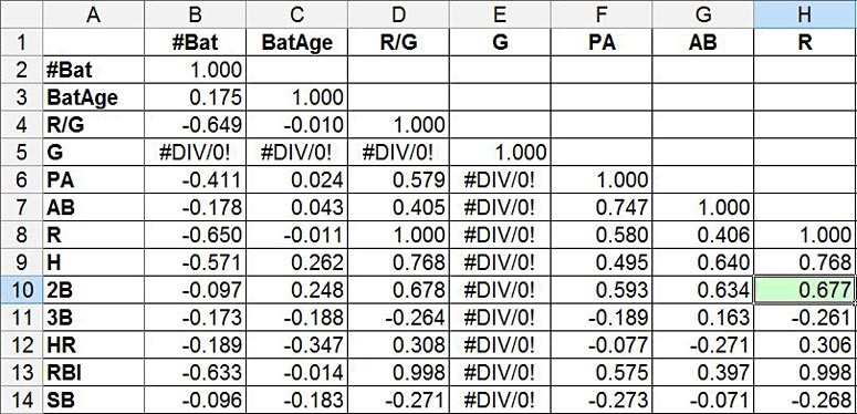
A cropped screenshot shows a table of variables and their level of correlation in the program Excel. A correlation analysis table shows a data table with values from -1 to 1 that measures the correlation for every pair of variables analyzed.
Figure 8. This correlation analysis shows a grid with correlation coefficients for every pair of variables. The coefficient for runs (R) and doubles (2B) is highlighted in green.
Note: Ignore cells that display "#DIV/0!". Because every team plays the exact same number of games (162, using 2013 example data), Excel is unable to calculate any correlation coefficients for the games played (G) variable.
- Examine the results of your correlation analysis, especially the correlation coefficients for the "runs" variable (R, column H). Do any of the other variables appear to correlate very strongly with runs scored, meaning they have a correlation coefficient close to +1 or -1? If so, these are the variables you will want to use for linear regression in the next step.
-
In Microsoft Excel 2003, you can run a correlation analysis by selecting Tools→Data Analysis→Correlation. (If this choice is not available, select "Tools/Add-Ins...", then check the "Analysis Toolpak" box, and click "OK".)
-
Perform a linear regression analysis on each the variables you selected in the previous step.
- You can only do a linear regression analysis on one pair of variables at a time — runs (R) and one other variable.
-
You will need to look up how to do linear regression analysis in your spreadsheet program. Your goal is to calculate r2 values, make a scatter plot with a trendline, and make a residual plot, like the one in the Introduction, for each combination of variables (remember that one variable will always be "runs," or R).
- In Excel 2003, you can select Tools→Data Analysis→Regression, to select the X and Y variables for your regression (the Y variable will always be "runs"). You can also check various options, for example, to automatically create residual plots (see Figure 9). You will need to look up what all of the options do in your spreadsheet program.
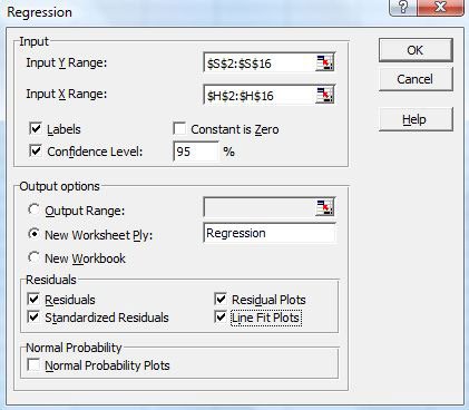
A cropped screenshot shows a regression dialog box in the program Excel which allows users to analyze a set of data. At the top of the dialog box there are boxes where ranges of data can be selected, labels are set and a confidence level can be assigned. Beneath that there are output options for the new graphs and residuals can be calculated for residuals, residual plots, standardized residuals and line fit plots.
Figure 9. The linear regression analysis window in Excel 2003.
- A less complicated approach is to create a scatter plot using two of the variables, then right-click the graph and select "Add Trendline" (in Excel 2003). In the trendline options, you can select "display R2 value on chart" to calculate the square of the correlation coefficient. This approach will not give you the residuals or a residual plot, but it will at least give you a good idea of how strong the correlation is between the variables.
- Make sure you repeat this step for each variable that appears to have a high correlation with runs according to your correlation analysis.
/-/https/www.sciencebuddies.org/cdn/Files/5389/5/correlation-analysis-excel-2003_img.jpg)
/-/https/www.sciencebuddies.org/cdn/Files/5390/5/correlation-coefficient-table_img.jpg)
/-/https/www.sciencebuddies.org/cdn/Files/5391/5/regression-analysis-excel-2003_img.jpg)
Analyzing Your Results
- Once you have completed a linear regression analysis for each variable that appears to be highly correlated with runs scored, compare their r2 values, scatter plots, and residual plots side by side. Which statistic seems to be the best at predicting runs scored?
- Remember that "correlation does not imply causation." If there is a high correlation between one variable and runs, does that necessarily imply that it causes more runs to be scored? Can you use your knowledge of baseball to explain any strong correlations you find, in terms of cause and effect?
Ask an Expert
Variations
Many variations of this project are possible. We're sure that you can think of more yourself, but here are a few ideas to get you started.
- Do you get the same results if you run this analysis for a different year? For a different baseball era? Can you think of reasons to explain any differences you find?
- Are there other derived statistics (besides RC, TA, and BRA) that might do a better job at predicting runs scored?
- You have to score at least one run to win a baseball game, so we expect teams that score more runs to win more games. However, you also have to keep the other team from scoring more runs than you do. So how well does a team's run-scoring ability correlate with winning percentage?
- Investigate correlations between team pitching statistics and winning percentage. Which pitching statistic is the best predictor of success?
Baseball Economics
- How well do player salaries correlate with offensive performance? In baseball it is generally expected that the three outfielders and the first and third basemen will produce runs for the team by being skilled with the bat. Assemble the individual batting and salary statistics for this group of players for a single season. How well does salary correlate with the various batting statistics used above? You can take this further by expanding your sample to multiple seasons.
- How well does team payroll correlate with winning percentage?
More Advanced Project Ideas
- Baseball and Athletic Longevity. History tells us that, over a human lifetime, the trajectory for most individual accomplishments is an arc. We all start off pretty much helpless as infants, grow in physical and mental skill through childhood, teenage years and young adulthood. If we are fortunate enough to live into old age, we also, inevitably, start to notice a decline in those same skills as the body and mind age. Baseball statistics provide a way to measure the trajectory of athletic ability for large numbers of individuals. There are many, many questions you could explore along these lines. What is the "average" age for peak performance? How much variance is there in this age? Does it differ for pitchers and batters? Which position has the greatest longevity? The shortest? Has peak performance age changed over time? Use year-by-year career statistics for individual players to identify their peak years by some measure that you devise. Compile and analyze tables of peak performance data for groups of players to answer one of the questions above, or a similar question that interests you.
- For more ideas, see Teaching Baseball Using Statistics, by Jim Albert (listed in the Bibliography).
Careers
If you like this project, you might enjoy exploring these related careers:
/-/https/careerdiscovery.sciencebuddies.org/cdn/Files/1815/24/stat.jpg)
/-/https/careerdiscovery.sciencebuddies.org/cdn/Files/17070/11/pexels-photo-5716042.jpg)
/-/https/careerdiscovery.sciencebuddies.org/cdn/Files/827/18/pexels-photo-3874622.jpg)
/-/https/careerdiscovery.sciencebuddies.org/cdn/Files/911/17/pexels-photo-4058382.jpg)

/-/https/img.youtube.com/vi/zJyByg2kEnU/0.jpg)
/-/https/img.youtube.com/vi/a30aAugNGFo/0.jpg)
/-/https/img.youtube.com/vi/NmMflaqzJXQ/0.jpg)