The Results are In: Plotting Numerical Ranges
Adding graphs to your science project display board helps others see how your project went. Knowing when to use a histogram, and how it differs from other kinds of charts, might just give you a statistical edge!
Collecting your data is an important part of your science project. But once you have the data from your testing trials, what is the next step? Only by looking at your data can you really determine the outcome of your experiment and how your hypothesis held up. You've got a bunch of numbers or temperatures or sizes or weights or other values, each corresponding to what happened to your dependent variable when you made various changes to your independent variable. Your data, in other words, relates directly to your hypothesis.
If you said you thought that "y" would increase when you changed "x," the data you logged in your science laboratory notebook during your experiment should show values for y at each different x that you tested. Your data might make sense to you immediately, but to present your data so that others can see and make sense of your results, you may need a chart. But what kind? Bar chart? Pie chart? Line graph? What about a histogram? The kind of chart you need has a lot to do with what kind of data you collected. If your data involves "ranges" of numbers, a histogram might be in order.
A Histo-huh?
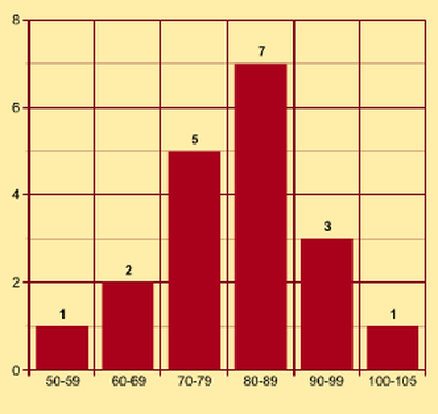
A histogram looks similar to a bar chart, but there is an important difference between the two. A histogram shows how data falls into numerical ranges or bins. If you are testing paper airplanes, you might make a chart that shows how far, on average, each different style of plane flew. A bar chart works fine to represent this data. By looking at your graph, you will be able to see, at a glance, which style of plane averaged the most distance. This is the kind of data gathering and charting you might do as part of the How Far Will It Fly? Build & Test Paper Planes with Different Drag aerodynamics project idea.
But what if you wanted to test, instead, two specific plane designs? You (and maybe some friends) might fly planes of each design fifty or more times each and record the distance for each flight. While you might create a cumulative bar graph comparing the average results of the two designs, you might also chart your data for each plane, showing how many times x-style plane flew 0-5ft, 6-10ft, 11-15ft, 16-20ft, 21-25ft, and 26-30ft. Each of your data points, each distance you recorded, would fit into one of those numerical "buckets." By sorting your data into numerical ranges, you make a histogram.
Tracking Trajectory
The new Bet You Can't Hit Me! The Science of Catapult Statistics math project idea lets you get hands-on with histograms. In this math project, you'll use the cool Ping Pong Catapult kit to experiment with the launch settings needed to propel a ball a certain distance (or at a certain target). Which pull-back angle will yield the longest launch? Pick an angle, catapult a ping pong ball fifty or more times, measuring the distance each ball travels before hitting the ground, and then plot your data. Pick another pull-back angle, or change another variable, and see which setting works better. Using histograms, you can explore the statistics related to your data. What's the mean distance for a certain launch profile? What's the standard deviation of the data? What's the distribution?
The ping pong exploration is a fun way to experiment with the physics of the catapult and put practical statistics in action at the same time. (This is only one of several projects students can do with the Ping Pong Catapult science kit.)
A Sweet Math Extension
After getting some practice with ping pong balls, you can do a similar statistics project, and get more hands-on practice with histograms, by creating an independent variation based on the M&M Math project idea. A bar chart is fine if you just want to show how many candies of each color, on average, were in the bag of candies you opened at lunch. But what if you want to see how often each color shows up when you count the candies in a dozen different bags? Get to counting! When you are done, you can create a separate histogram for each of your candy colors and compare how the colors are distributed.
After that? Grab some friends and share!
Categories:
You Might Also Enjoy These Related Posts:
- Plastics and Earth Day - Science Projects
- Arduino Science Projects and Physical Computing
- 10+ Robotics Projects with the BlueBot Kit
- 5 STEM Activities with Marshmallow Peeps
- March Madness Basketball Science Projects: Sports Science Experiments
- Women in STEM! More than 60 Scientists and Engineers for Women's History Month
- Explore Artificial Intelligence and Machine Learning with Student AI Projects
- 10 Reasons to Do the Rubber Band Car Engineering Challenge