Data Analysis & Graphs
Key Info
- Review your data. Try to look at the results of your experiment with a critical eye. Ask yourself these questions:
- Is it complete, or did you forget something?
- Do you need to collect more data?
- Did you make any mistakes?
- Calculate an average for the different trials of your experiment, if appropriate.
- Make sure to clearly label all tables and graphs. And, include the units of measurement (volts, inches, grams, etc.).
- Place your independent variable on the x-axis of your graph and the dependent variable on the y-axis.
Overview
Overview
Take some time to carefully review all of the data you have collected from your experiment. Use charts and graphs to help you analyze the data and patterns. Did you get the results you had expected? What did you find out from your experiment?
Really think about what you have discovered and use your data to help you explain why you think certain things happened.
Calculations and Summarizing Data
Often, you will need to perform calculations on your raw data in order to get the results from which you will generate a conclusion. A spreadsheet program such as Microsoft Excel may be a good way to perform such calculations, and then later the spreadsheet can be used to display the results. Be sure to label the rows and columns—do not forget to include the units of measurement (grams, centimeters, liters, etc.).
You should have performed multiple trials of your experiment. Think about the best way to summarize your data. Do you want to calculate the average for each group of trials, or summarize the results in some other way such as ratios, percentages, or error and significance for really advanced students? Or, is it better to display your data as individual data points?
Do any calculations that are necessary for you to analyze and understand the data from your experiment.
- Use calculations from known formulas that describe the relationships you are testing. (F = MA , V = IR or E = MC²)
- Pay careful attention because you may need to convert some of your units to do your calculation correctly. All of the units for a measurement should be of the same scale— (keep L with L and mL with mL, do not mix L with mL!)
Graphs
Graphs are often an excellent way to display your results. In fact, most good science fair projects have at least one graph.
For any type of graph:
- Generally, you should place your independent variable on the x-axis of your graph and the dependent variable on the y-axis.
- Be sure to label the axes of your graph— don't forget to include the units of measurement (grams, centimeters, liters, etc.).
- If you have more than one set of data, show each series in a different color or symbol and include a legend with clear labels.
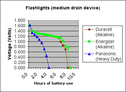
The example line graph shows three different brands of batteries in color coded lines and measures the voltage remaining as the battery is used over time. A key to the right of the graph shows Duracell represented by a red line, Energizer represented by a green line and Panasonic represented by a blue line. All batteries start at 1.6 volts and slowly decrease. After around 5 hours the Panasonic battery is drained completely while the Energizer and Duracell batteries drain at a very similar rate, lasting for 9-10 hours.
Different types of graphs are appropriate for different experiments. These are just a few of the possible types of graphs:
A bar graph might be appropriate for comparing different trials or different experimental groups. It also may be a good choice if your independent variable is not numerical. (In Microsoft Excel, generate bar graphs by choosing chart types "Column" or "Bar.")
A time-series plot can be used if your dependent variable is numerical and your independent variable is time. (In Microsoft Excel, the "line graph" chart type generates a time series. By default, Excel simply puts a count on the x-axis. To generate a time series plot with your choice of x-axis units, make a separate data column that contains those units next to your dependent variable. Then choose the "XY (scatter)" chart type, with a sub-type that draws a line.)
An xy-line graph shows the relationship between your dependent and independent variables when both are numerical and the dependent variable is a function of the independent variable. (In Microsoft Excel, choose the "XY (scatter)" chart type, and then choose a sub-type that does draw a line.)
A scatter plot might be the proper graph if you're trying to show how two variables may be related to one another. (In Microsoft Excel, choose the "XY (scatter)" chart type, and then choose a sub-type that does not draw a line.)
Sample
Sample
Here is a sample Excel spreadsheet (also available as a pdf) that contains data analysis and a graph.
Checklists
Data Analysis Checklist
| What Makes for a Good Data Analysis Chart? | For a Good Chart, You Should Answer "Yes" to Every Question |
| Is there sufficient data to know whether your hypothesis is correct? | Yes / No |
| Is your data accurate? | Yes / No |
| Have you summarized your data with an average, if appropriate? | Yes / No |
| Does your chart specify units of measurement for all data? | Yes / No |
| Have you verified that all calculations (if any) are correct? | Yes / No |
Graph Checklist
| What Makes for a Good Graph? | For a Good Graph, You Should Answer "Yes" to Every Question |
| Have you selected the appropriate graph type for the data you are displaying? | Yes / No |
| Does your graph have a title? | Yes / No |
| Have you placed the independent variable on the x-axis and the dependent variable on the y-axis? | Yes / No |
| Have you labeled the axes correctly and specified the units of measurement? | Yes / No |
| Does your graph have the proper scale (the appropriate high and low values on the axes)? | Yes / No |
| Is your data plotted correctly and clearly? | Yes / No |