How does spin affect the trajectory of a kicked soccer ball?
Moderators: kgudger, bfinio, MadelineB, Moderators
-
deleted-954178
- Posts: 1
- Joined: Sat Nov 21, 2020 5:55 pm
- Occupation: Student
How does spin affect the trajectory of a kicked soccer ball?
For my science project, my teacher is requiring us to put all of our data in the form of a graph in order to put on the poster board we will present about our project. If I am questioning whether where you kick a soccer ball has any impact on where it lands in the goal, how would I form all of my results into a graph? Say I concluded that kicking in the upper left quadrant would result in the ball landing in the right side of the goal and vice versa, how would I put that into a graph? This is the only thing keeping me from using this as my experiment, not knowing whether I will be able to graph my results afterwards.
-
audreyln
- Expert
- Posts: 287
- Joined: Fri Oct 01, 2010 7:28 am
- Occupation: Engineer - Chemical
- Project Question: n/a
- Project Due Date: n/a
- Project Status: Not applicable
Re: How does spin affect the trajectory of a kicked soccer ball?
Hello,
Sounds like a fun project! You have one variable (where you kicked the ball) and one result (where the ball went into the goal) that you'd like to included in your graph. Did you do multiple test of each variable and measure the results each time? For example, you kicked the ball in the upper left quadrant 10 times which resulted in 8 balls going into the right side of the goal and 2 balls going into the left side of the goal.
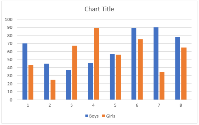
I would suggest a bar chart with multiple bars for each category. In Excel this is called a "Clustered Column" chart with a different colored column for each goal location. In the example below the blue bar could be right side of goal, the orange bar could be left side of goal, and the numbers across the X-axis could be different locations you kicked the ball (upper right, lower left, etc). The Y-axis would show how many times the result occurred in your multiple tests. For example, in the "Upper Left" category on the X-axis you would have a blue bar (right side) that was 8 units high and a orange bar (left side) that was 2 units high.
Hope this helps!
Audrey
Sounds like a fun project! You have one variable (where you kicked the ball) and one result (where the ball went into the goal) that you'd like to included in your graph. Did you do multiple test of each variable and measure the results each time? For example, you kicked the ball in the upper left quadrant 10 times which resulted in 8 balls going into the right side of the goal and 2 balls going into the left side of the goal.
I would suggest a bar chart with multiple bars for each category. In Excel this is called a "Clustered Column" chart with a different colored column for each goal location. In the example below the blue bar could be right side of goal, the orange bar could be left side of goal, and the numbers across the X-axis could be different locations you kicked the ball (upper right, lower left, etc). The Y-axis would show how many times the result occurred in your multiple tests. For example, in the "Upper Left" category on the X-axis you would have a blue bar (right side) that was 8 units high and a orange bar (left side) that was 2 units high.
Hope this helps!
Audrey