Abstract
Can you remember what the weather was like last week? Last year? Here's a project that looks at what the weather was like for over a hundred years. You'll use historical climate data to look at moisture conditions in regions across the continental U.S. You'll use a spreadsheet program to calculate the frequency of different moisture conditions for each region and make graphs for comparison. Which part of the country has the most frequent droughts? The most frequent periods of prolonged rain? The most consistent precipitation? Here's one way to find out.Summary
/-/https/www.sciencebuddies.org/cdn/Files/2330/3/Weather_img011.jpg)
Objective
The goal of this project is to compare long-term precipitation patterns in different regions of the country. You will work with historical climate data, and you will use a spreadsheet program to make histograms and analyze the data.
Introduction
In this project you will analyze historical climate data (from 1895 to the present) for different regions in the continental United States. You will learn how to use a spreadsheet to calculate the relative frequencies of wet, normal and dry conditions for each region. You will also learn how to make histograms of your data in order to compare the different regions of the country.
The National Climatic Data Center (NCDC) has several different types of historical climate data covering the period from 1895 to the present. There are monthly records on temperature and precipitation, plus calculated indices that show the severity of a wet or dry spell. There will be detailed instructions in the Experimental Procedure section on how to download the data and import it into the spreadsheet program. First, though, you need some background information on what is in the data files. There is a lot of information in the data files, but if you take your time reading through the descriptions and then browsing through the data files, you will be able to make sense of it. Making a print-out of the project will help, too (use the "Printable version" button at the top of the page).
The data you will be using for this project is called the Palmer Hydrological Drought Index (PHDI). This is a monthly value (index) that indicates the severity of a wet or dry spell. It is based on the principles of balancing supply and demand for moisture, and is used to assess the long-term moisture supply (description from the "drought.README" file on the NCDC ftp site).
The PHDI generally ranges from +6 to −6, with occasional values in the range of +7 and −7. Negative values denote dry spells; positive values denote wet spells. Table 1 shows the ranges of the index and corresponding categories of wetness or dryness.
Table 1. Palmer Hydrological Drought Index (PHDI) Categories
| PHDI Range | Category | |
| From (low) | To (high) | |
| 4.00 | > 4.00 | Extreme Wetness |
| 3.00 | 3.99 | Severe Wetness |
| 1.50 | 2.99 | Mild/Moderate Wetness |
| −1.49 | 1.49 | Near Normal |
| −2.99 | −1.50 | Mild/Moderate Drought |
| −3.99 | −3.00 | Severe Drought |
| < −4.00 | −4.00 | Extreme Drought |
For this project, you will be downloading a data file that contains state, regional, and national monthly average values for PHDI. The following table shows you how the columns of data are organized within the file.
Table 2. Data Format for State/Regional/National PHDI File
| Data | Region Code |
Division (always 0) |
Data type (PHDI=6) |
Year | Monthly values, Jan–Dec | |||||||||||
| Jan | Feb | Mar | Apr | May | Jun | Jul | Aug | Sep | Oct | Nov | Dec | |||||
| Cols | 1–3 | 4 | 5 | 6–9 | 10–16 | 17–23 | 24–30 | 31–37 | 38–44 | 45–51 | 52–58 | 59–65 | 66–72 | 73–79 | 80–86 | 87–93 |
The data file contains 48 data blocks for individual states, then 9 data blocks for larger geographical regions, and finally one data block for the entire continental U.S. You will be working with the regional data. There are nine separate regions, each consisting of two or more states. The drought index for each region is the weighted average of the drought index for each state within the region. The weights are set according to area of the state relative to the area of the region. The following table shows the states that make up each of the nine regions. The table also gives the code for each region (used as an identifier in the data file), and the relative weight for each state used to calculate the weighted average.
Table 3. Geographical Regions for Averaged Data
| Region Code | Region Name | States | |
| name | weight | ||
| 101 | Northeast | CT | 0.02752 |
| DE | 0.01130 | ||
| ME | 0.18251 | ||
| MD | 0.05812 | ||
| MA | 0.04537 | ||
| NH | 0.05112 | ||
| NJ | 0.04306 | ||
| NY | 0.27242 | ||
| PA | 0.24910 | ||
| RI | 0.00667 | ||
| VT | 0.05280 | ||
| 102 | East North Central | IA | 0.22098 |
| MI | 0.22854 | ||
| MN | 0.33003 | ||
| WI | 0.22045 | ||
| 103 | Central | IL | 0.18169 |
| IN | 0.11691 | ||
| KY | 0.13013 | ||
| MO | 0.22449 | ||
| OH | 0.13279 | ||
| TN | 0.13609 | ||
| WV | 0.07790 | ||
| 104 | Southeast | AL | 0.17576 |
| FL | 0.19944 | ||
| GA | 0.20051 | ||
| NC | 0.17952 | ||
| SC | 0.10576 | ||
| VA | 0.13900 | ||
| 105 | West North Central | MT | 0.31307 |
| NE | 0.16432 | ||
| ND | 0.15035 | ||
| SD | 0.16393 | ||
| WY | 0.20833 | ||
| 106 | South | AR | 0.09335 |
| KS | 0.14461 | ||
| LA | 0.08530 | ||
| MS | 0.08388 | ||
| OK | 0.12291 | ||
| TX | 0.46995 | ||
| 107 | Southwest | AZ | 0.26819 |
| CO | 0.24544 | ||
| NM | 0.28645 | ||
| UT | 0.19993 | ||
| 108 | Northwest | ID | 0.33593 |
| OR | 0.38990 | ||
| WA | 0.27416 | ||
| 109 | West | CA | 0.58943 |
| NV | 0.41057 | ||
This project just scratches the surface of what you can do with historical data. There are many interesting hypotheses that you can investigate with similar methods. By including data from additional sources (e.g., sea surface temperature, other climatological data, or Landsat imagery) you can further expand the range of hypotheses. The Variations section has some ideas to get you started, and you can come up with your own as well.
Terms and Concepts
To do this project, you should do research that enables you to understand the following terms and concepts:
- Drought
- Regional climate
- Palmer Hyrdological Drought Index (PHDI)
- Frequency histogram
Questions
- What are the differences between climate and weather?
- Which regions have the most consistent precipitation patterns?
- Which regions have the most variable precipitation patterns?
- What are the major geographical factors that influence precipitation in different regions of the United States?
- What are the major oceanographic factors that influence precipitation in different regions of the United States?
Bibliography
- Here is an Excel tutorial to get you started with using a spreadsheet program:
Excel Easy. (n.d.). Excel Easy: #1 Excel tutorial. Retrieved June 11, 2014. - NCDC ftp source for US precipitation, temperature and Palmer Drought Series data (see Variations, Table 4, for descriptions of the data files available here):
NCDC. (2006). ftp Site for U.S. Historical Climate Data. National Climatic Data Center, NOAA. Retrieved March 3, 2006. - Additional online sources of free historical weather data:
National Drought Mitigation Center. (n.d.). United States Drought Monitor Data. The Drought Monitor. Retrieved July 14, 2014. - NASA Earth Observatory drought page:
Herring, D. (2005). Dry Times in North America. NASA Earth Observatory. Retrieved March 3, 2006.
Materials and Equipment
To do this experiment you will need the following materials and equipment:
- computer with Internet access and a spreadsheet program (e.g., Excel),
- printer for graphs.
Experimental Procedure
- Do your background research so that you are knowledgeable about the terms, concepts and questions.
- If you are not familiar with using a spreadsheet program, be sure to take the time to go through the Excel tutorial listed in the Bibliography.
- Here is a short version of the data analysis steps you'll be following in order to create your drought frequency histograms. Use the links to jump down to the detailed sections. Use your browser's "back" button to return to this brief list:
- Download the historical data and import into Excel. (Downloading and Importing Data)
- Format the data for statistical analysis. Copy the data for each climatic region to a separate page (there are nine separate regions, plus an averaged data set for the entire continental U.S.). You should also add column headers to each page to identify the data columns. (Formatting the Data)
- Calculate PHDI category frequencies for each region. (Calculating PHDI Category Frequencies for Each Region)
- Create frequency histograms for the PHDI categories for each region. (Creating Frequency Histograms)
- Compare the results. (Comparing the Results)
- If spreadsheets are something new for you, then the detailed explanations that follow should help. If you are already comfortable with using spreadsheets, then you should be in good shape on your own.
Downloading and Importing Data
- Download the State/Regional/National PHDI data file from NCDC. Right-click on the following link and select "Save As..." to save the PHDI data file on your computer. (To see all of the other available data files, use the link in the Bibliography.)
- Import the saved climate data into your spreadsheet program. Here's how to do it in Excel:
- From the menu, select File/Open.... You'll see a dialog like the one here.
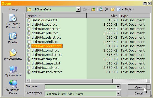
- At the bottom of the File Open dialog, under "Files of type:" use the drop-down list to select "Text Files (*.prn, *.txt, *.csv)".
- Navigate to the directory where you saved the climate data file ("drd964x.phdist.txt"), select it, and click "Open."
- Excel now takes you through the Text Import Wizard, a series of three dialogs. The first dialog looks like this (climate data file shown):
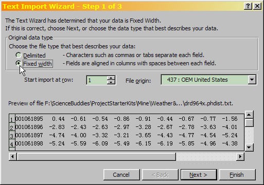
Excel text import wizard (step 1) with "Fixed Width" selected under original data type. The text import wizard also includes a preview of the selected data format.
- Make sure "Fixed width" file type is selected, then click "Next."
- The second Text Import Wizard dialog is used to set the field widths. It looks like this:
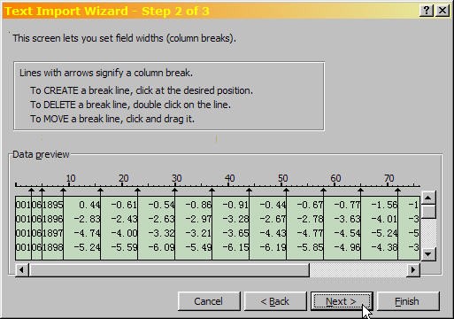
Excel shows an example of how the text file is going to be imported. The data needs to be recognized and broken into rows and columns for analysis.
- The lines with arrows show where Excel will be breaking the data into columns. (Table 2 in the Introduction describes how the data is arranged in the file.) Check to make sure that each of the data columns has been recognized (use the horizontal and vertical scroll bars to view all of the columns).
- For the PHDI data file, you'll probably find that you need to add two column breaks: 1) after the 3-digit region code (cols 1–3) and 2) after the data code (col 5). The image has the two additional column breaks (compare with the Text Import Wizard image). Also, note that the dialog box has instructions for adding, moving and deleting column breaks.
For the PHDI data file, you'll probably need to add two column breaks: 1) after the 3-digit region code (cols 1–3) and 2) after the data code (col 5). Also, note that the dialog box has instructions for adding, moving and deleting column breaks.
- When all of the data columns are set to your satisfaction, click "Next".
- The final step of the Text Import Wizard is to select data formats for each of the columns, as shown here.
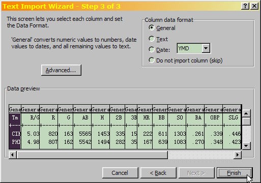
Excel text import wizard (step 3) with "General" selected under column data format. The text import wizard also includes a preview of the data format selected.
- The default selection, "General", is what you want for any column with numerical data. Since all of the data in the file is numeric, the default selections are fine, so click "Finish" to import the data.
- From the menu, select File/Open.... You'll see a dialog like the one here.
/-/https/www.sciencebuddies.org/cdn/Files/2330/3/Weather_img011.jpg)
/-/https/www.sciencebuddies.org/cdn/Files/2331/3/Weather_img012.jpg)
/-/https/www.sciencebuddies.org/cdn/Files/2332/3/Weather_img013.jpg)
/-/https/www.sciencebuddies.org/cdn/Files/2328/3/Sports_img009.jpg)
/-/https/www.sciencebuddies.org/cdn/Files/2329/3/Sports_img010.jpg)
Formatting the Data
The first part of the file contains data for the individual states, followed by regional averages for nine separate regions (described in Table 3 in the Introduction). At the end of the file is one final data set with averages over the entire continental U.S. This project uses the regional data. In this section, you will be copying the data for each region and pasting it onto its own worksheet. You'll also add a header line to identify each data column. You'll also learn a little trick for keeping the header line visible even when you're scrolling through the data.
- Let's start with the header line first, since it will make it easier to navigate through the data file. Here's how to add a header line to identify each data column.
- First you'll need to insert an empty row. Right-click on the row label for row 1, and then select "Insert" from the popup menu, as shown here:
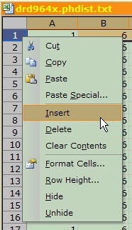
An empty row is inserted by right-clicking row 1 and selecting insert.
- The data columns are described in Table 2 in the Introduction. Your spreadsheet should have data in columns A–O. Label column A "Region Code". Label column B "Data Code". Label column C "Year". The remaining twelve columns are the months of the year. Label each with a three-letter abbreviation.
- Select row 1 and then use the menu to select "Format/Column/AutoFit Selection."
- If you wish, you can also make other formatting adjustments (bold, centering, gray background, etc.) to the header line (see example here).

The column label begins with Region Code for column 1, Data Code for column 2, Year for column 3, and the months of the year starting from January for the remainder of the columns 4-15.
- To keep this header line visible even when you scroll down in the file, first select the row here the header line (row 2). Then, use the menu to select "Window/Freeze Panes." That's it! Your header line will stay put when you scroll down in the file.
- First you'll need to insert an empty row. Right-click on the row label for row 1, and then select "Insert" from the popup menu, as shown here:
- Here's how to copy the regional data to individual worksheets.
- Insert a blank worksheet by using the menu to select "Insert/Worksheet."
- Select the data for one region. The nine different regions (described in Table 3 in the Introduction) have Region Codes in the range 101–109. You can scroll down with the mouse to find the next region, and make your data selections by clicking and dragging (which is easy, but gets tedious after awhile). Or, you can do a little math to calculate where each block of data begins and ends and use the "Name Box" to do the selections by typing.
- Once you've selected all of the data (from 1895 to present) for a single region, copy it and then paste it in to the new, blank worksheet. Paste it in starting at row 2, to save a row for the header line.
- It's a good idea to name the page with an abbreviation for the region so you can keep track of the data more easily. To re-name a page, you can double-click on the tab at the bottom, then type in the new name.
- Repeat these steps for each of the nine regions.
- Finally, you can copy the header line to each of the pages and do the "Freeze Panes" trick.
/-/https/www.sciencebuddies.org/cdn/Files/2333/3/Weather_img015.jpg)
/-/https/www.sciencebuddies.org/cdn/Files/2334/3/Weather_img016.jpg)
Calculating Drought Severity Frequencies for Each Region
Now the real fun starts. You have the data for each region on its own worksheet, and now you can easily create formulas to calculate how frequently the various moisture conditions occurred for each region. Table 1 in the Introduction defines seven different moisture conditions, ranging from "Extreme Wetness," to "Extreme Drought." You want to know how frequently each condition occurred over the last hundred-odd years in each region. The information is all there in the worksheets, but how do you get it out?
The answer is, "By counting!" Fortunately, you don't have to count by hand. You can have Excel count for you. At the bottom of each regional worksheet, you're going to make a table like this one:
/-/https/www.sciencebuddies.org/cdn/Files/2335/3/Weather_img017.jpg)
The moisture condition table has a totals column that adds the values for each row. This moisture table has 7 different moisture levels across 12 months with a totals column and frequency column at the end of the table.
There are seven rows, one for each moisture condition. For each of the twelve month columns (Jan–Dec), you'll have Excel scan through all hundred-plus years of data and count the number of occurrences of each condition. Then, you'll add up the totals (across and down, as shown by the arrows), and use the totals to calculate the frequency of each condition. The rest of this section will take you through step-by-step.
- To do the counting, you'll write a formula for each moisture condition using Excel's "COUNTIF()" function.
- COUNTIF() will go through a range of cells, counting each cell whose value meets the criterion that you specify. COUNTIF() takes two arguments: the range of cells to scan, and the criterion for counting.
- Table 1 shows that "Extreme Wetness" corresponds to the range PHDI >= 4.00.
- So, to count all of the cells that belong in this category for January, you would click on cell D115 and type in: =COUNTIF(D$2:D$113, ">= 4.00").
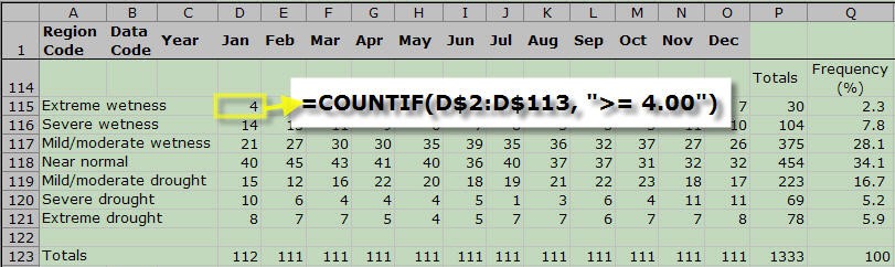
The first cell in Extreme wetness for January uses a formula to count all January cells that have a value greater than or equal to 4. The COUNTIF function is used to accomplish this.
- Table 1 shows that the next condition, "Severe Wetness," corresponds to the range 3.00 <= PHDI <= 3.99. How do we count a range with COUNTIF()? You ask Excel to count all of the cells with PHDI values greater than or equal to 3.00, and then to subtract the counts that are above 3.99. Like this: =COUNTIF(D$2:D$113,">= 3.00") - COUNTIF(D$2:D$113, "> 3.99").
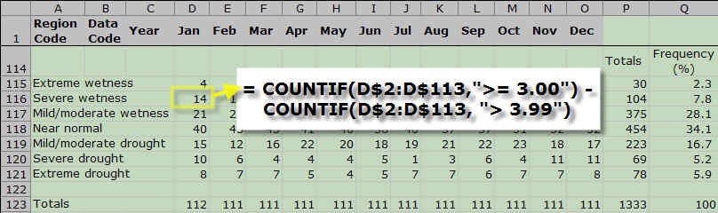
The first cell in Severe wetness for January uses a formula to count all January cells that have values between 3 and 3.99. The COUNTIF function is used to accomplish this so manual counting is not needed. This step is repeated using the table values for the rest of the rows.
- With these two examples, you should be able to fill in the rest of the formulas. Use Table 1 to find the ranges for each condition.
- Once you've filled in the formulas for January, you can copy them to the other months.
- The next step is to calculate the totals for the rows and columns. Use Excel's SUM() function for this.
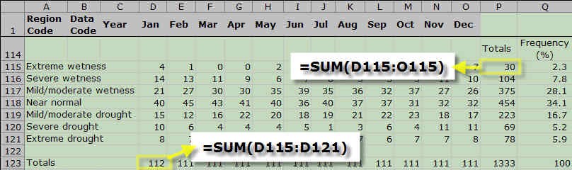
Each row and column is added together using the SUM function in excel. The SUM function allows you to select certain cells (like each value in January), and add them at the bottom of the table. This is done for every row and column in the table.
- Column P now contains the totals for each condition for the entire time period. You can use column Q to show the frequency for each condition. For each category, calculate the proportion of the total counts and multiply by 100. An example is shown here:
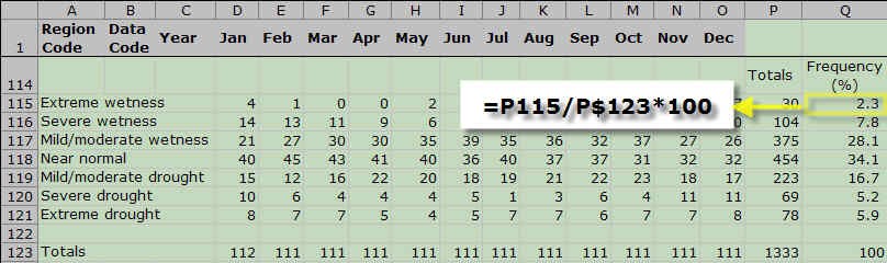
Table showing the frequency of wetness conditions by month from extreme wetness to extreme drought. Overall frequency is calculated by taking the total value of each row, dividing it by the total of all rows, and the multiplying it by 100.
- Notice that the totals in Row 123 serve as a way to check your work. Each cell should be counted once and only once, so the totals for each column should equal the number of years that data was collected for that column. (This file was from February, 2006, so January has 112 years of data and all the other months have 111 years of data.) The frequency column (Q) should add up to 100%. If your numbers don't add up right, check your COUNTIF formulas carefully. Make sure the ranges correspond exactly to what is in Table 1.
- When your table for calculating frequencies is working properly, you can copy it to each of the other regional worksheets.
/-/https/www.sciencebuddies.org/cdn/Files/2336/3/Weather_img018.jpg)
/-/https/www.sciencebuddies.org/cdn/Files/2337/3/Weather_img019.jpg)
/-/https/www.sciencebuddies.org/cdn/Files/2338/3/Weather_img020.jpg)
/-/https/www.sciencebuddies.org/cdn/Files/2339/3/Weather_img021.jpg)
Creating Frequency Histograms
- Now that you've generated the data, creating the histogram is easy. Start by selecting the frequency values in column Q, then use the menu to select "Insert/Chart..." You'll see a dialog like the one here:
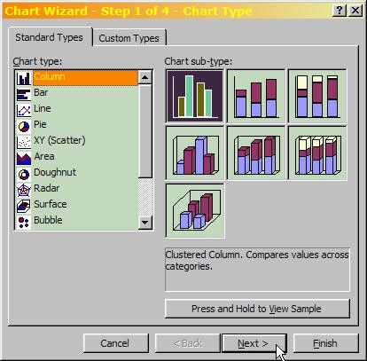
- Select the "Column" Chart Type and then push "Next."
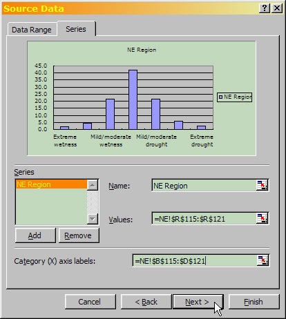
- In the "Source Data" dialog, select the "Series" tab. The "Values" field should already be filled in from your selection. Select the category labels from column A as the "Category (X) axis labels." Name the series for the region, if you wish. Then press "Next."
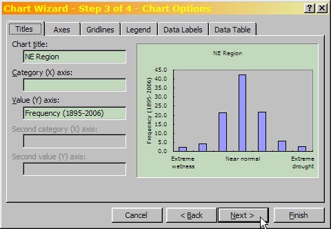
- The next dialog is for Chart Options. You can use the tabs to make some adjustments to the graph, like adding titles and removing the legend.
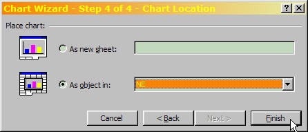
- In the last dialog, you select a destination for your graph, then press "Finish."
- If you want to make additional tweaks to the appearance of the chart, you can usually get to the appropriate dialog by double-clicking on the item you want to change.
/-/https/www.sciencebuddies.org/cdn/Files/2340/3/Weather_img022.jpg)
/-/https/www.sciencebuddies.org/cdn/Files/2341/3/Weather_img023.jpg)
/-/https/www.sciencebuddies.org/cdn/Files/2342/3/Weather_img024.jpg)
/-/https/www.sciencebuddies.org/cdn/Files/2343/3/Weather_img025.jpg)
Comparing the Results
- Create histograms for each of the regions.
- Be sure to make all of them the same size and scale so that you can make direct comparisons.
- You may also want to create a single large histogram with data from all of the regions. Some comparisons are easier to make on a single, large graph, and others are easier to make with multiple, small graphs.
- Study the graphs and see what differences, similarities and patterns you can find.
- Identify the regions on a map of the U.S. What geographical features might explain some of the patterns you found in the climate data?
Ask an Expert
Global Goals
The United Nations Sustainable Development Goals (UNSDGs) are a blueprint to achieve a better and more sustainable future for all.
/-/https/www.sciencebuddies.org/cdn/Files/19756/5/E-WEB-Goal-13.png)
Variations
- This is just one way of looking at the data. Think of other ways that you might graph the same data to answer different questions. What season has the most frequent droughts? The most frequent wet weather? Is it the same season in every region of the country?
- If you are interested in extending this project to other types of historical climate data, Table 4 describes the other data files available from the NCDC ftp site. The top half of the table lists the State/Regional/National data files (like the one described for this project). There is information available on temperature, precipitation and four different drought indices. The "Data Code" column shows the one-digit code that appears in column 5 of the data file (see Table 2). The bottom half of the table lists the State Division data files. These contain the same type of information as the regional State/Regional/National files, but at higher spatial resolution. Each state is divided into geographic divisions, and the climate data is reported for each of these divisions.
Table 4. NCDC Historical Climate Data Files (1895–Present)
Swipe left to see moreState+Regional+National Data Files Filename Description Data Code state.README detailed information on data N/A drd964x.pcpst.txt Precipitation 1 drd964x.tmpst.txt Temperature 2 drd964x.pdsist.txt PDSI 5 drd964x.phdist.txt PHDI 6 drd964x.zndxst.txt ZNDX 7 drd964x.pmdist.txt PMDI 8
Swipe left to see moreState Division Data Files Filename Description Data Code drought.README detailed information on data N/A drd964x.pcp.txt Precipitation 1 drd964x.tmp.txt Temperature 2 drd964x.pdsi.txt PDSI 5 drd964x.phdi.txt PHDI 6 drd964x.zndx.txt ZNDX 7 drd964x.pmdi.txt PMDI 8 - The NCDC ftp site also has temperature and precipitation data, and several other drought indices (see Table 4). How do these data compare across different regions of the country?
- If you are interested in examining climate at a finer spatial scale, the NCDC ftp site also has data by geographic regions within individual states (see Table 4). What were the frequencies of different climatic conditions in your area over the last hundred-plus years?
- For a more advanced project, you could look for correlations in climate patterns between different regions of the country. You could also look for correlations between regional climate patterns and larger-scale phenomena such as El Niño and La Niña. For information on how to do correlation calculations with spreadsheet data, see the Science Buddies project: Which Team Batting Statistic Predicts Run Production Best?.
- The Bibliography lists additional sources of historical climate data. How far back in time can you extend this type of analysis? What types of climate data are available for the pre-historic era?
Careers
If you like this project, you might enjoy exploring these related careers:
/-/https/careerdiscovery.sciencebuddies.org/cdn/Files/1141/17/iStock-1170687091.jpg)
/-/https/careerdiscovery.sciencebuddies.org/cdn/Files/1815/24/stat.jpg)
/-/https/careerdiscovery.sciencebuddies.org/cdn/Files/815/17/unsplash-5hZJVGPG6vo.jpg)
/-/https/careerdiscovery.sciencebuddies.org/cdn/Files/17070/11/pexels-photo-5716042.jpg)

/-/https/img.youtube.com/vi/jr3BOE_EpOk/0.jpg)
/-/https/img.youtube.com/vi/D17eWH-cS9c/0.jpg)
/-/https/img.youtube.com/vi/T1VhYSLscuI/0.jpg)