Picturing Big Data: The Science of Infographics
With more data flowing in than most of us can ever hope to sift through, infographics have emerged as a viewer-friendly way to convey data-driven information. In a new human behavior science project, students explore the process of turning big data into visual representations and investigate how easy it can be to create a picture of data that may lead viewers to draw the wrong conclusions.
/-/https/www.sciencebuddies.org/cdn/blog/graphics/2015-blog-infographic-data.png)
Curious about the distribution of coffee shops in your neighborhood? There's an infographic for that. Wondering about the sleeping habits of creative geniuses and artists? There's an infographic for that. Interested in how the money raked in from Star Wars movies and related merchandise breaks down? There's a Millennium Falcon infographic for that.
No matter what topic you are interested in, you can probably dig up at least one infographic, maybe dozens. Some of them are very basic. Some have been created by online tools that automate the process of infographic creation. Some infographics, however, are very thoughtfully turning data into art.
Simplifying Data
In recent years, infographics have become a pervasive part of our information streams. With a format that resembles a digital poster, infographics offer visual representations of sets of data to help explain a subject in terms of its statistics. With their vibrant approach to conveying information, and with their ability to distill complicated data into something you can assess at a glance, infographics have become a form of visual Cliff Notes on virtually any topic you can imagine. There are specialized Pinterest boards devoted to infographics, and fans of the medium can sign up with online sites to receive daily infographics by email.
In their simplified format, infographics offer a modern, colorful, data-laden spin on information, a visual way to help people quickly understand and relate to a subject. Part of the beauty of an infographic is that it serves up data in an easily digestible format and offers bite-sized blocks of meaningful data. The popularity of the medium suggests that many people prefer their information in visual form. It's fast. It's colorful. It's easy. Infographics strip down information and shine a spotlight on specific categories of quantifiable data. In many cases, the data is data you might not otherwise run across. For example, one of the infographics in a "best of" infographics roundup for 2014, plots the most popular food in each state. Choose a state, and you can see other contenders, but a glance at this map might make you wonder about where you live. Or, after taking a look, you may realize that maybe you should move.
While infographics are pervasive in popular culture, the underlying trend of data visualization is an increasingly important area for scientists. Part of the potential of data visualization is the chance that plotting data in a visual format will lead to unexpected insight—that a visual look at data may answer questions, highlight trends, or lead to new discovery. The quest to find ways to better synthesize and present data from big data sources is both challenging and exciting for today's scientists, and whether trying to convey information to a general audience or trying to find new ways to understand and make sense of available data in an area of research, data scientists are finding that by using innovative visualization techniques, more nuanced understanding of a data set may rise to the surface.
A picture may be worth a thousand words, but when it comes to sets of big data that are unfathomably large in scope, finding ways to plot data visually has the potential to open up new areas of research and new ways to better understand that data—because you can see it.
Bringing Data to Life
A recent article in Wired covers a map created by Jill Hubley that shows all of the trees in New York City. Using publicly available data from a prior census, the map pinpoints the location of 592,130 trees using a colorful system that makes the data accessible in new ways. (For more information about Hubley's process, see her blog.)
/-/https/www.sciencebuddies.org/cdn/blog/graphics/2015-blog-big-data-map-trees.png)
Viewers looking at Hubley's map may draw some immediate conclusions about the trees in New York City. There are a bunch of trees. But the map of the data has also led to new and important findings regarding the balance of native and pervasive trees in the area. (Even a cursory look at the color balance of the aggregate map may be telling.)
It is this possibility, the chance that by plotting data visually something new, important, or unknown will emerge that makes the science of data visualization in the age of big data so exciting.
Charting Data
Visualizing data using charts is key to the process of turning data into something meaningful. Students use charts to plot the results of their science project testing. Doctors use charts to evaluate an individual's weight or blood pressure or height over the years. Schools use charts to report testing scores and to convey admissions demographics. Charts are everywhere. Pie charts. Bar graphs. Scatterplots. Histograms.
Infographics capitalize on the usefulness of a chart and turn the presentation of "data" into something that is at once creative and informative. It is no wonder infographics are popular. You don't have to do the work to sift through or track down the data. You don't have to analyze that data, decide what goes on each axis, or figure out how to best aggregate the information to draw conclusions. The infographic shows you selected data in a nice, neat, and colorful format. You can "pin" it, "share" it, email is, or print it out and put it on a bulletin board.
But how accurate is a data visualization? From where did the data come? Do the visual representations used convey information in a way that makes sense? How clear is the visualization? Will all viewers understand it the same way?
When it comes to the fun infographics you see day to day, you may not worry about these issues. But for data scientists, ensuring that the visual form of the data doesn't cause misinterpretation is a very important consideration. There are countless ways that data may be arranged and presented, and the decisions a data scientist makes may influence how a viewer interprets and understands the data.
Infographic Science
In an infographic, elements of design are key. The typography you use, the colors you choose, the ways in which you break down and allocate space, integrate icons and images, and balance text and data is critical to the overall success of the infographic. The format you choose for your data, too, is key.
Pie chart or bar chart? Timeline? Circular or linear? Vertical or horizontal? These sound like simple questions, but when it comes to how someone will understand what is being shown (and what conclusions they will draw), the answers may make a big difference.
A new project idea at Science Buddies helps young scientists take a closer look at how data visualization can help present big data and how people may rightly or wrongly interpret data based on how that data is visually shown.
In the Picture This: How Visualizing Data Can Lead to the Right (or Wrong) Conclusion project, students explore issues related to the format in which data is presented. Visualizations are key to helping scientists better understand (and convey to the public) information gleaned from big data sets. But with so much data involved, it is important to keep the primary objective (or question) in mind. What are you trying to find out and/or show? What is the best way to hone in on that information in a meaningful way? What categories of information are required to enable a viewer to understand the data and draw the correct significance or conclusion?
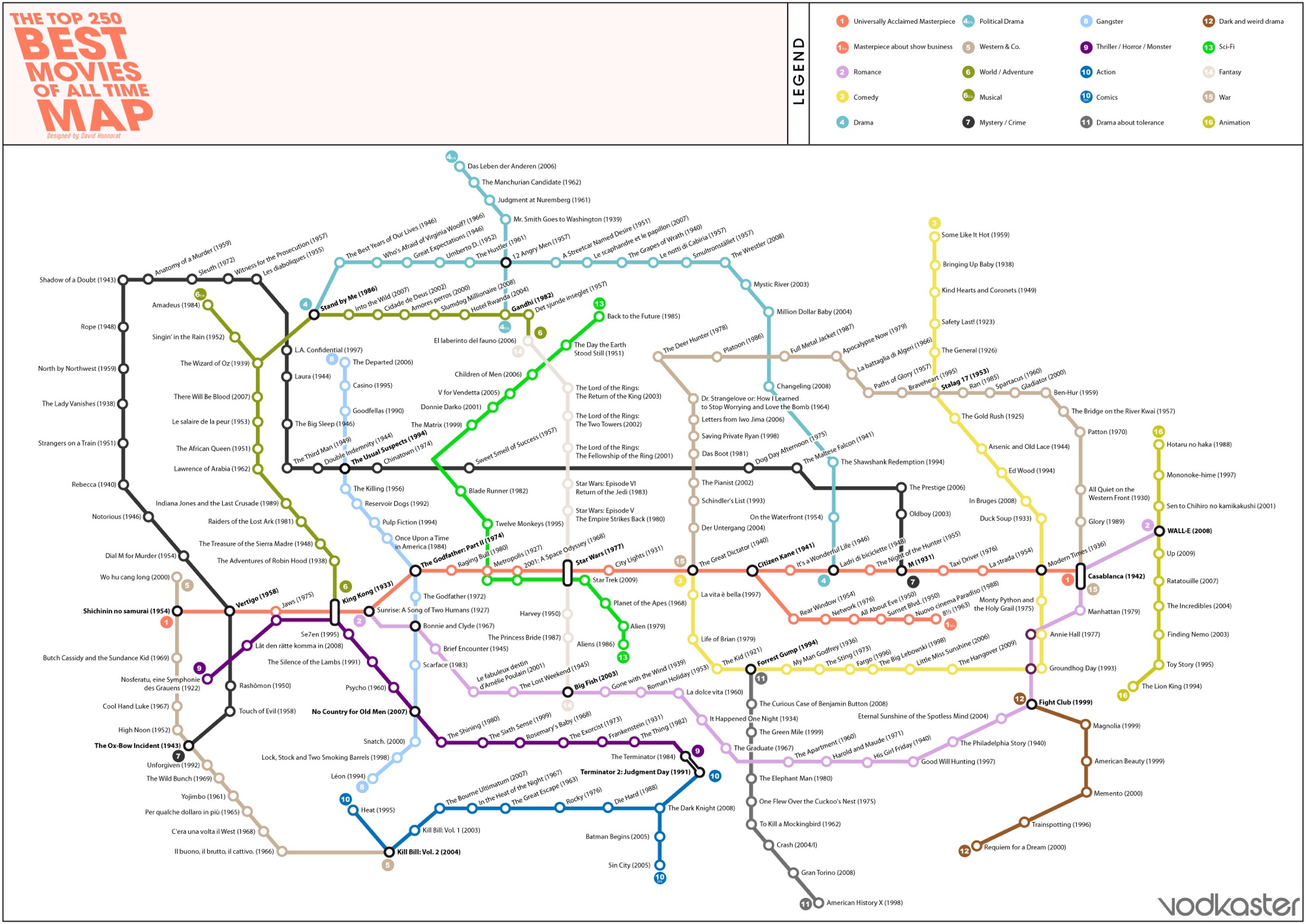
Take the following three infographics as an example. Each of them is loosely based on popular movies. But each has taken a very different approach to visualizing the data and each has a different focus.
/-/https/www.sciencebuddies.org/cdn/blog/graphics/2015-blog-infographic-top-grossing-movies-small.png)
/-/https/www.sciencebuddies.org/cdn/blog/graphics/2015-blog-infographic-drama-is-king-imdbs-movies-small.png)
Making Visual Connections
In the Picture This project, students learn more about visualization techniques, aggregation of data, and the ways in which different presentation of the same information may lead to viewers misreading, misunderstanding, or otherwise drawing the wrong conclusion. To put questions about data format to the test, students set up three different infographics conveying the same information but each using a different format to see how the inclusion or omission of "density" information in data regarding populations or numbers of events in geographic areas changes how viewers understand the data when they see it presented visually. This human behavior project requires groups of volunteers and offers students the chance to see, firsthand, how infographics work.
For another project that ties into human behavior, sociology, and big data, see the Social Media: When and Where Do People Post? project. An enterprising student with an interest in big data, marketing, or data design might piggyback this project onto the infographics one as a next step in exploring big data and visualization techniques!
A "Creative" STEM Career
Data visualization is a field that blurs the line between design and science, making it an exciting area for those who enjoy creative thinking, design, and the intricacies of data. Students curious about infographics and data visualization may want to read more about the data scientist STEM career path.
Read More About Infographics, Data Visualization, and Big Data—Or Do a Big Data Science Project
A Sampling of Infographics
- Color Emotion Guide
- Independent Coffee Shops in San Francisco
- New York State Dams
- Which Birth Dates are More Common?
- There's Always Room for Pie
- The Beautiful Flow of Pi
- Vegetables: When Are They In Season?
Online Resources
- What is Big Data?
- Life Sciences and Big Data: What's the Big Deal?
- Explore the World of Big Data with Your Science Project
- Producing Scientific American Infographics in the Era of "Big Data"
- How to Choose the Form of an Infographic: It's All about Context"
- There's No Infographic without Info (and other Lessons from Malofiej)
- The Power of using Infographics to Communicate Science
- How to make infographics: a beginner's guide to data visualisation
- Big Data Project Ideas
Books
- The Wall Street Journal Guide to Information Graphics: The Dos and Don'ts of Presenting Data, Facts, and Figures
- Envisioning Information
- The Best American Infographics 2014 (The Best American Series)
- The Best American Infographics 2013 (The Best American Series)
- Infographics Designers Sketchbooks
- Information Graphics
- Cool Infographics: Effective Communication with Data Visualization and Design
/-/https/www.sciencebuddies.org/cdn/blog/graphics/thumb/2015-blog-infographic-data-thumb.png)
Categories:
You Might Also Enjoy These Related Posts:
- Sun and Solar Science Projects - Solar Energy STEM
- 10 STEM Projects to Get Started Building Circuits on a Breadboard!
- Ocean Science Projects, Lessons, and Experiments
- Women in STEM! More than 60 Scientists and Engineers for Women's History Month
- Black History Month STEM - Learn More About These 40 Scientists for Black History Month!
- 10 Reasons to Do the Ball Run Engineering Challenge
- 40 New and Cutting-Edge Science and Engineering Projects in 2025
- 25+ Coding Projects for Beginners and Beyond - CSEdWeek Resources


/-/https/img.youtube.com/vi/T1VhYSLscuI/0.jpg)
/-/https/img.youtube.com/vi/2G4pTsKW_pU/0.jpg)
/-/https/img.youtube.com/vi/aF--ekfU1ec/0.jpg)